Fushifaru Resort – Visual Identity Design


The Island
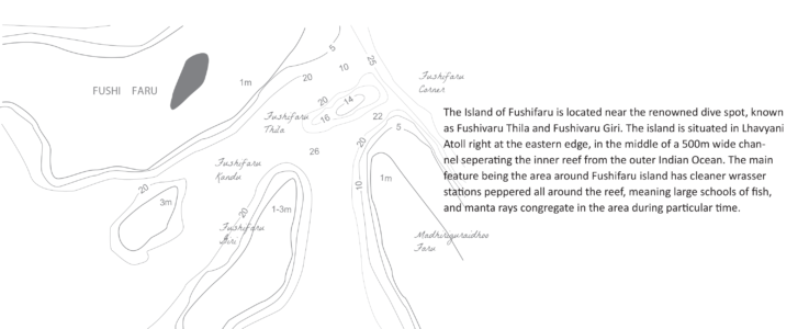
The Island of Fushifaru is located near the renowned dive spot, known as Fushivaru Thila and Fushivaru Giri. The island is in Lhavyani Atoll right at the eastern edge, in the middle of a 500m wide channel separating the inner reef from the outer Indian Ocean. The main feature around Fushifaru island is the cleaner wrasser stations peppered all around the reef, meaning large schools of fish, and manta rays congregate near the area during particular time. The rapid current that stream through the channel accentuates the brilliant soft corals, making this particular area, vibrant in colour and in diverse marine life, also an environmentally protected area.
Brand
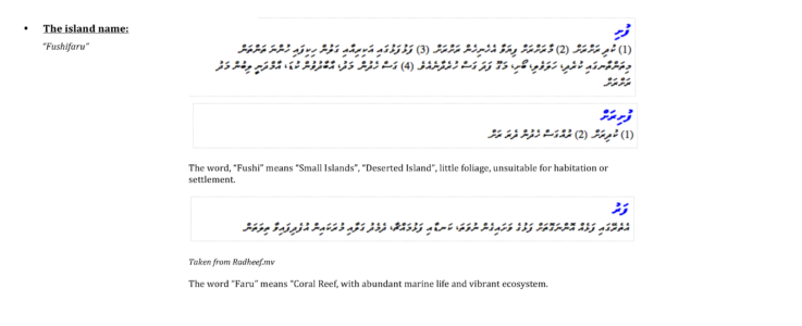
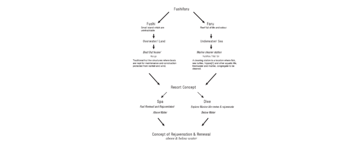
The brand is developed based on the distinctive geography, and ecosystem the island is located at, as well as the name, “Fushi”, meaning small island, and “Faru”, meaning reef. The model breaks down the two aspects of the name and reconstruct it as a unique selling proposition for the resort i.e. “Well being & Diving”. The visual concept for the brand will be derived using this model.
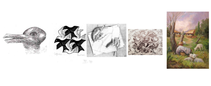
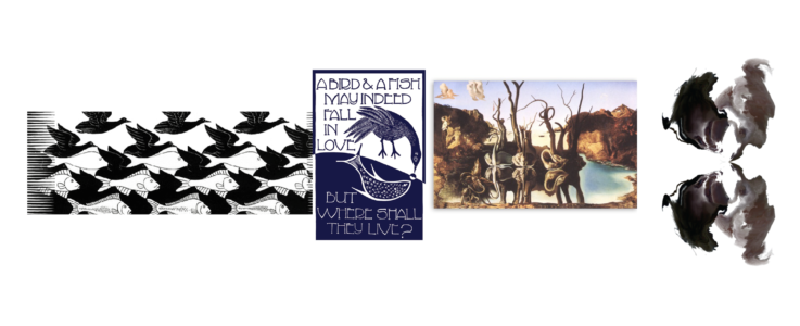
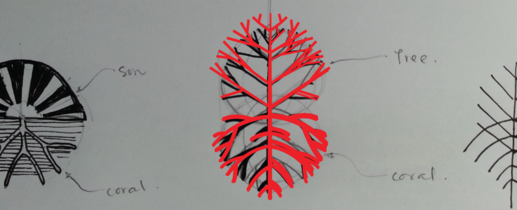
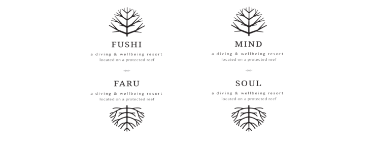
Symbol
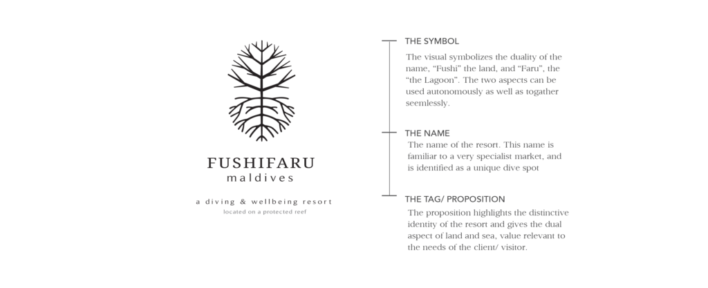
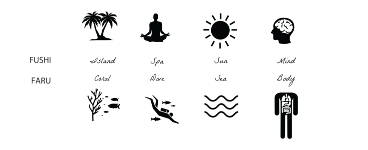
The visual identity is a symbolic interpretation of the name, “Fushifaru”, as well as the dualities within nature. The logo represents how these dual aspects are a reflection of one another, hence the distinctive natural ecosystem which makes the area unique is reflected in the service and product above on land.
Tagline
The tagline reinforces the unique selling proposition, and makes it an official part of the visual identity.The tag also enables the visual identity to become part of an overall brand of service and resort product, which is differentiated from the existing product on the market.
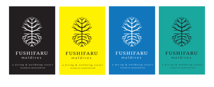
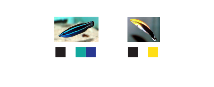
Colour

The visual elements will give the visual identity support, and salience, and help evoke the narrative behind symbol in more depth.
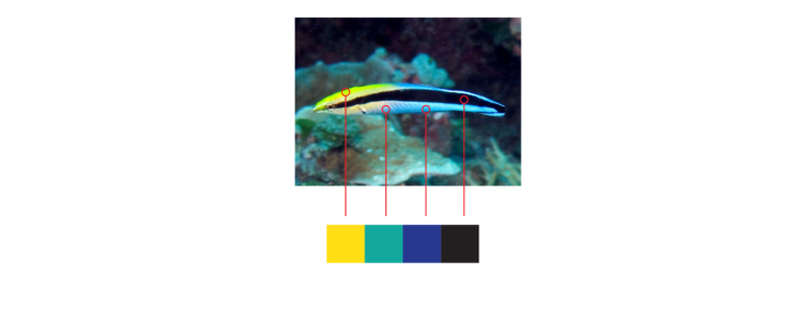
The element is derived from an aspect of the current location, which makes it distinctive. The space the island is located and the reef known as Fushifaru Giri, & Thila, are known as one of few, Cleaning Stations, located in the Maldives, where Manta Rays, Whale Sharks, Turtles and other fish comes to get cleaned by cleaner wrassers, known as Labroides dimidiatus. These cleaner wrassers has a very distinctive colours, and markings, and these distinctive colours will be signified in the visual elements of the brand identity. .
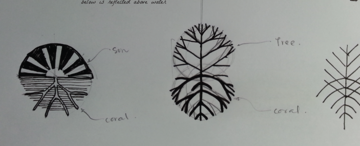
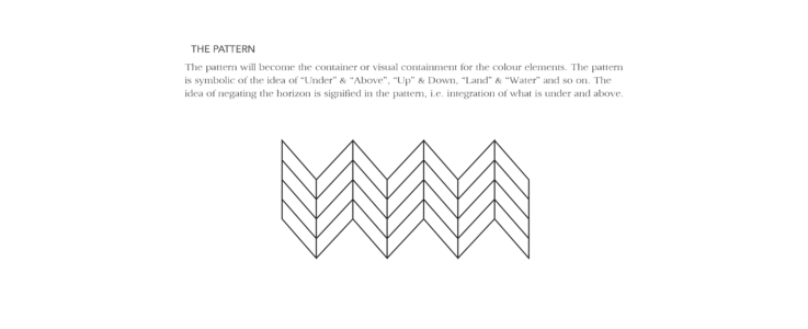
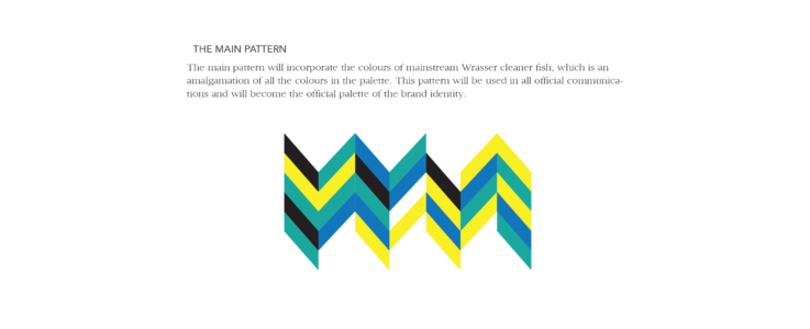
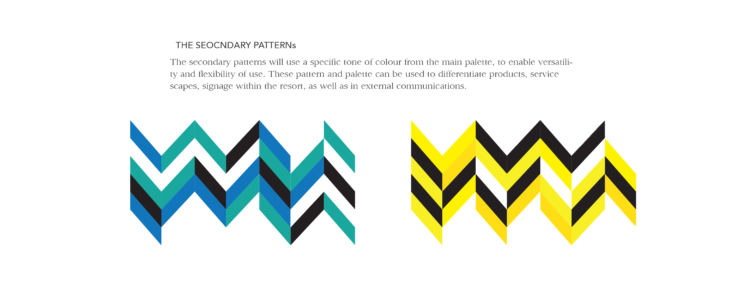
Pattern

The pattern will become the container or visual containment for the colour elements. The pattern is symbolic of the idea of Under & Above, Up & Down, Land & Water and so on. The idea of negating the horizon is signified in the pattern, i.e. integration of what is under and above.