Rebranding m-s-p-a-c-e
m-s-p-a-c-e is an architectural and engineering firm based in the Maldives. The company was concieved as partnership between the architectural arm of mooinc. pvt. ltd, a multidisciplinary design firm, hereof dissolved, and Civenge, an established engineering firm, also based in Maldives’.
The expectation was to enable the company to have consistent and coherent voice which is relevant to its client base. In this case the objective of the brand is to enable the company to acquire this voice by making the visual identity, an integral part of the internal operation of the company, i.e. the language or the alphabet that dictates this voice. This meant that the visual identity had to become a tangible resource or the infrastructure through which the process was realised, managed, maintained, monitored and communicated, internally as well as externally.
It was also important that the brand identity had an emotional connection with the companies personnel as well as the client base it served. To do this we had to acknowledge the history of both firms, in order to show that it’s a continuation, not a new wholly new company.
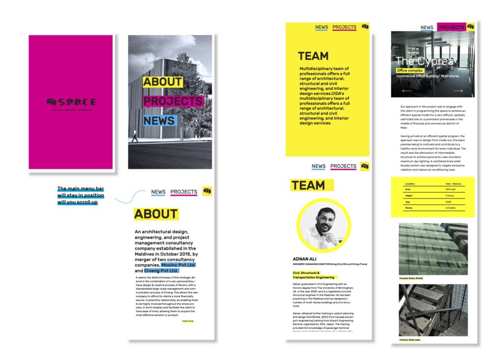
The brand identity had to visually showcase the scope of the services it provides, in a way that is relevant and recognisable to potential client as well as its employees. The idea for the visual identity had to have a unique narrative and depict it in a way that was believable, applicable, and appropriate to the kind of service the company provided.
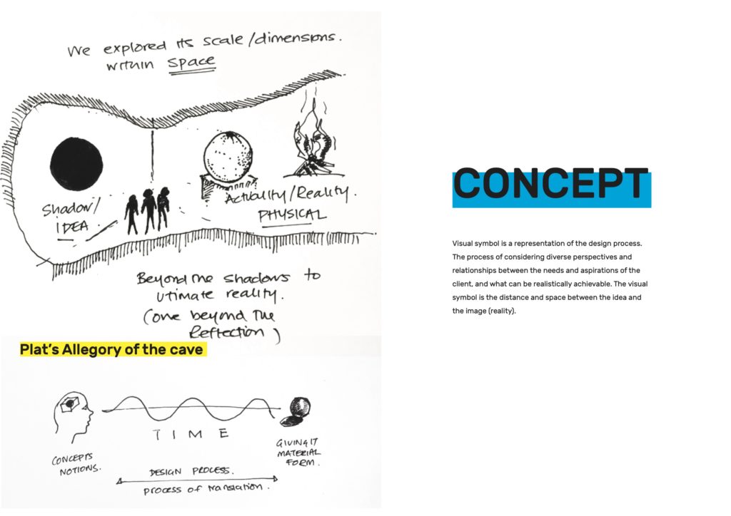
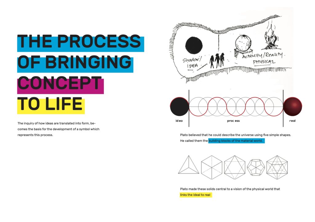
We explored the visual components of previous mooinc. pvt. ltd, visual symbol which had also continued to be a major part of the existing m-s-p-a-c-e logo, i.e. black circle. We tried to deconstruct this visual symbol and explore diverse perspectives and dimensions as well as symbolic references inherent within it, to see if we can conceive a wholly new form that best express the process and approach of this new company.
Video done in collaboration with Dhahau Naseem & Farhad Mohamed.
After a lot of time spent exploring, experimenting with the design team at m-s-p-a-c-e, to get to a visual form that was both easily applicable, as well as meaningful, we were coming to a dead end, and time was running out. We found that we were trying to do too much, and I knew we had to get some fresh perspective on everything we had done thus far by involving someone who can take everything we had considered and bring it to a logical and coherent end. Thats when Ayesh came on board, and was able to do just that. She was able to recognise the core idea we were after, and turn into a form that encaspulated it fully. This is one of the most collaborative logo development process I was involved in, and at the end one of the most fulfilling.


Giff created by Ayesh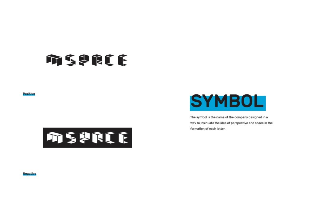
Client: mspace pvt. ltd.
Marketing Consultant: Ali Saeed
Collaborators: Farhad Mohamed, Dhahau Naseem, Ayesh, & mspace team